
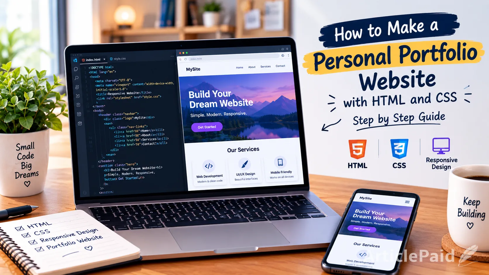
In today's mobile-first world, having a website that looks great on every device isn't optional—it's essential. Whether visitors browse on a phone, tablet, or desktop, your site needs to adapt smoothly. This guide walks you through the fundamentals of building a responsive website using just HTML and CSS.
What Is a Responsive Website?
A responsive website automatically adjusts its layout, images, and content based on the screen size of the device being used. Instead of building separate versions of a site for mobile and desktop, responsive design uses flexible grids, images, and CSS rules so one codebase works everywhere.
Why Responsiveness Matters
- Better user experience: Visitors don't need to pinch or zoom to read content.
- Improved SEO: Search engines like Google prioritize mobile-friendly websites in rankings.
- Wider reach: A responsive site works across phones, tablets, laptops, and desktops without extra development effort.
Setting Up the HTML Structure
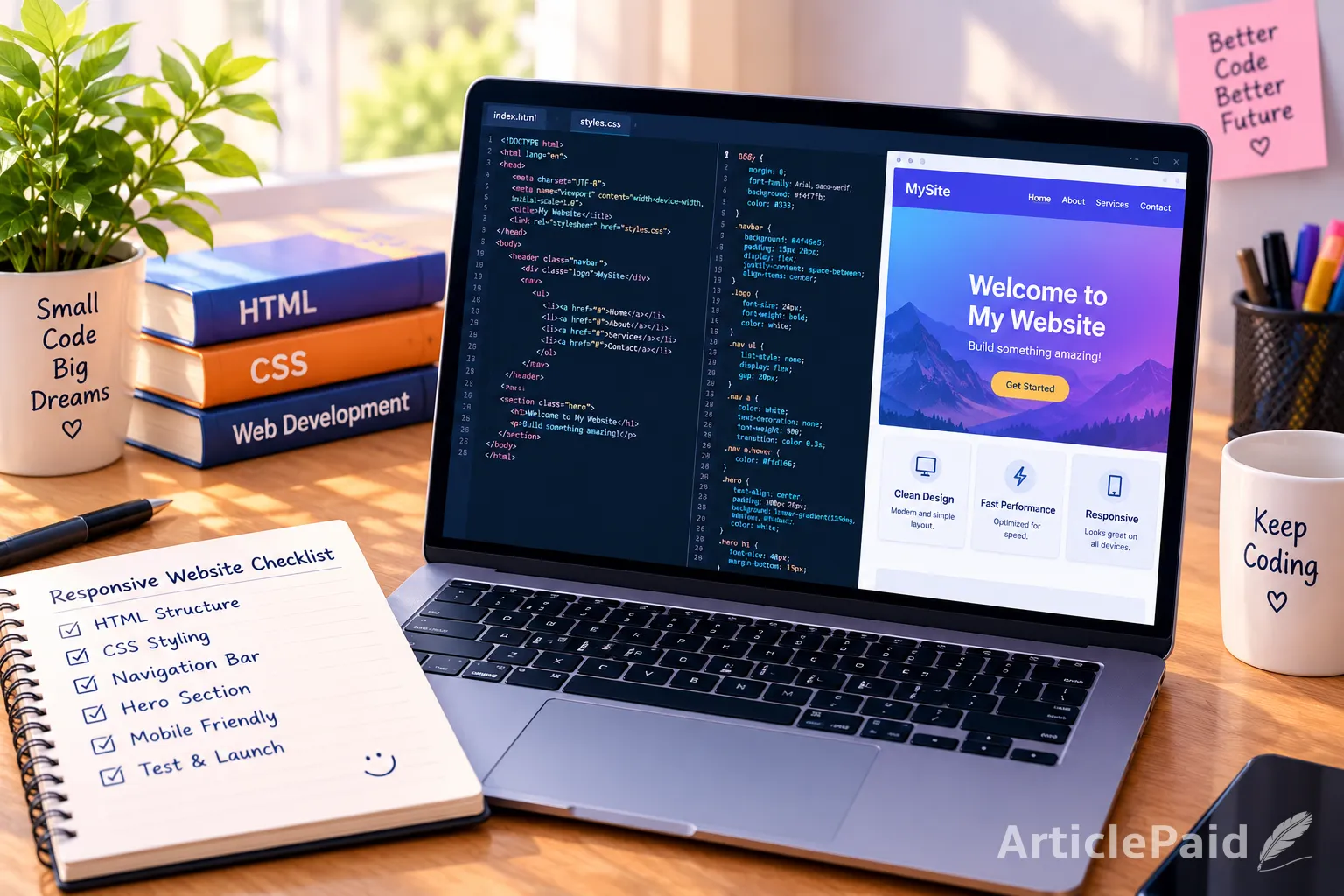
Every responsive website starts with clean, semantic HTML. Semantic tags like this not only organize your content logically but also help search engines understand your page structure—a small but meaningful SEO boost.
The Viewport Meta Tag
One of the most important lines in responsive design is the viewport meta tag, placed inside your <head>:
<meta name="viewport" content="width=device-width, initial-scale=1.0">This tells the browser to match the page's width to the device's screen width, preventing content from appearing zoomed out on mobile devices.
Using CSS for Flexible Layouts
Once your HTML structure is ready, CSS handles the visual adaptation.
Fluid Grids Instead of Fixed Widths
Avoid fixed pixel widths for layout containers. Instead, use relative units like percentages or modern layout tools like Flexbox and CSS Grid:
.container {
  display: flex;
  flex-wrap: wrap;
  width: 100%;
}
Media Queries
Media queries let you apply different styles based on screen size:
@media (max-width: 768px) {
  .container {
    flex-direction: column;
  }
}
This example stacks elements vertically on smaller screens, improving readability on mobile devices.
Responsive Images
Images should scale within their containers rather than overflowing them:
img {
  max-width: 100%;
  height: auto;
}
Testing Your Responsive Design
Before publishing, test your website across multiple devices and screen sizes. Browser developer tools (accessible via F12 in most browsers) let you simulate different devices instantly. Look for issues like overlapping text, broken layouts, or images that don't scale properly.
Best Practices for Beginners
- Start with a mobile-first approach, designing for small screens before scaling up.
- Keep your CSS organized using consistent class naming conventions.
- Avoid overusing fixed widths and heights.
- Test typography sizes to ensure readability across devices.

Final Thoughts
Building a responsive website doesn't require complex frameworks—a solid understanding of HTML and CSS fundamentals is enough to get started. By using semantic markup, flexible layouts, and media queries, you can create websites that look professional and function smoothly on any device, all while boosting your site's SEO performance.


















Responses (0)
Sign in to share your thoughts.
Sign in